Menu
-
Projects
-
Sefroyek Website Internet Services & B2B Infrastructure
-
Rankmetrics SEO Dashboard Web Application – SaaS Dashboard
-
Find Top Spots Website (Directory Platform)
-
Paratrade Web Platform (Trading Dashboard + Marketplace)
-
Estinext Mobile Application (IoT / Smart Devices)
-
Ranabit Web Platform (Exchange + Dashboard + Learning Hub)

A full rethinking of a multi-service internet provider’s website, aligning business goals, SEO needs, and user experience across desktop and mobile.
-
-
Case Studies
-
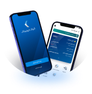
Kian Digital Application A financial advisory and investment platform for Iranian people, offering ETFs and stocks to help users manage their financial life. View Case Study

-
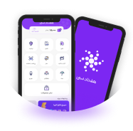
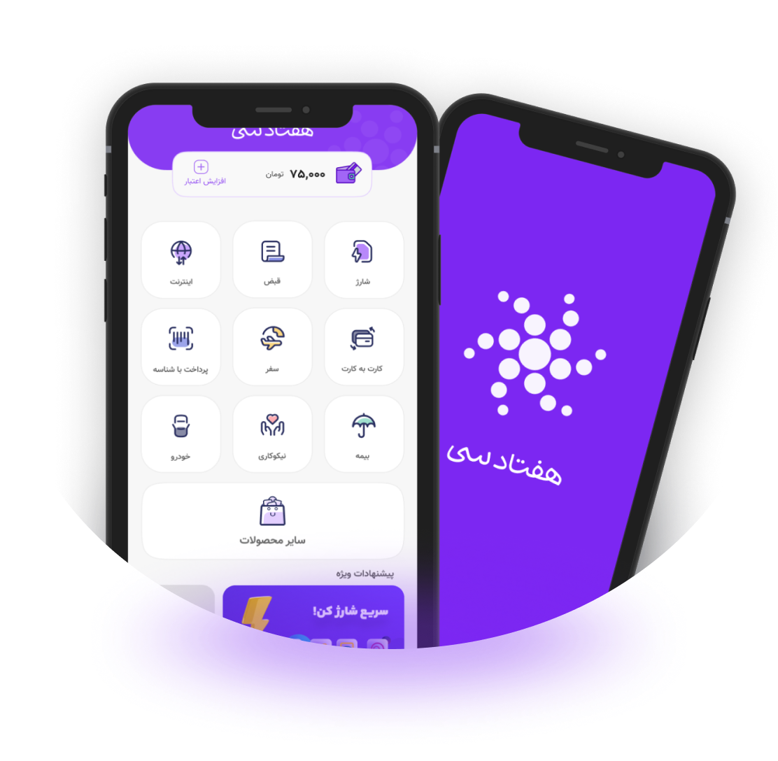
7030 Application A payment app which helps users to pay their bills, transfer money, get top-ups and other payment services. View Case Study
-
- About Me
- Contact Me