8 Min Read Case Study
Basion was an AI healthcare platform for rare-disease patients and
caregivers. Conversation was its main interface, allowing people to
ask questions, describe their experiences, manage health information,
and find relevant support.
But chat was not always the easiest way to answer. I designed a
Generative UI system that allowed the agent to introduce structured
interfaces inside the conversation, using selectors, checklists,
searchable inputs, generated forms, file uploaders, cards, and
confirmation controls instead of relying only on free-form text.
The aim was not to turn chat into a collection of forms. It was to use
conversation when context mattered and familiar controls when users
needed more guidance or precision.
ROLE Senior Product Designer
TIMELINE Sep 2025 – Jul 2026
PRODUCT STAGE Early access
TEAM Front-end & Back-end Dev, QA, AI Eng, Design Lead, Product Owners
The early product relied heavily on typed conversation. Voice
input was planned for later, so even simple or predictable answers
had to be written as messages.
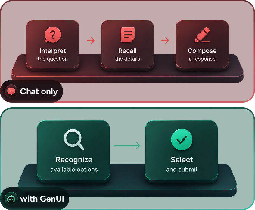
This created unnecessary work. A question about symptoms, for
example, required the user to interpret the question, recall the
details, compose an answer, and type it. A checklist could give
the same question a clearer scope and let the user respond through
recognition rather than recall.
This mattered for patients who might already be dealing with
fatigue, pain, uncertainty, or a complicated medical history. It
also mattered for caregivers managing information on someone
else's behalf. The interface needed to help them answer, not give
them another communication task to manage.
The same question can be answered through open-ended recall and composition, or through structured recognition and selection.
The need became clear while we were designing an early version of
onboarding.
We kept basic profile details outside the conversation. Users
selected their role and completed predictable information such as
their name, date of birth, region, language, and avatar through
familiar form controls. Making the agent ask for each field
separately would only have added more messages.
The chat-like part began after that setup. It asked where users
were in their healthcare journey: still searching for answers,
recently diagnosed, or living with a condition for a while. Each
answer led to a predefined branch of follow-up questions.
This onboarding was later replaced, and the questions were not yet
selected dynamically by the agent. But the exploration introduced
a useful pattern: ask a conversational question, provide a
structured way to answer it, then use that answer to continue the
flow.
Role selection, basic profile setup, journey-stage selection, and a predefined follow-up question.
This early onboarding was later replaced, but its structured conversational patterns became the starting point for GenUI inside the real agent chat.
The first set of components was small: selectors, checklists,
search inputs, and text fields. As we explored more situations,
the same need appeared elsewhere. The agent had to collect
files, guide longer tasks, present information, and request
confirmation.
I organized the library around three jobs:
Collect information Inputs, search, selectors, checklists, date and range pickers, textareas, and file uploaders gave the agent more suitable ways to request structured answers.
Guide longer tasks Generated forms and steppers could combine several related questions without creating one long page or a separate chat message for every field..
Present, review, and act Cards, accordions, confirmation controls, and diff components helped the agent show results and ask users to review an action before it happened.
The library grew from onboarding controls into patterns for collecting information, guiding tasks, and presenting results.
Structured answers without requiring users to format everything themselves.
Components could be combined when a task required several related answers.
GenUI also helped the agent show results, request approval, and support actions.
More than fifteen interaction patterns grouped around collecting information, guiding tasks, and presenting results or actions.
A component was not complete once its default UI had been
designed. It also needed to make sense inside a conversation and
after the interaction was finished.
For each GenUI pattern, I designed and documented four connected
parts:
1. Component:
the interactive control, including relevant states and
validation.
2. Usage documentation:
when it should be used, how it behaved, and what the frontend
needed to support.
3. In-chat example:
how the agent introduced the component inside a real
conversation.
4. Submitted state:
what remained after the user answered or completed an action.
For inputs, selectors, checklists, and forms, the interactive UI
became a compact user message after submission. Users could
correct saved information through conversation, although direct
editing was an area I would have explored further.
A selector shown as a component, documented pattern, in-chat interaction, and submitted user response. Each pattern was designed as a complete conversational lifecycle, not an isolated UI component.
The library also included loading, disabled, incomplete, validation, failure, and completed states where they were relevant. File upload was a clear example. Each file showed whether it was still uploading, had completed successfully, or had failed and could be retried. These states gave users feedback without taking them away from the conversation.
Uploading, completed, and failed states designed as part of the same conversational pattern.
Not every task could be completed with one input. For longer
tasks, we designed a form container that could combine the fields
needed for that situation, such as text inputs, dates, selectors,
and descriptive answers.
When several groups of information were required, a stepper could
break the task into smaller stages. This avoided presenting one
long form or asking for every field through a separate message.
The generated form worked in the product. After submission, it was
replaced by a readable summary in the user's message style.
The container could combine different input types based on the information required.
After submission, the form was replaced by a readable summary in the conversation.
Rare Connect showed that GenUI could also support discovery and
actions. Instead of describing a suggested person in a long
response, the agent displayed a member card with the information
needed to consider the recommendation.
If the user sent a request, the card remained visible and its
action changed to Request sent. Unlike a form response, keeping
the card preserved the context of who the action belonged to. The
member card was implemented and used in the product.
The recommendation card remained in the conversation after interaction because its context was still useful.
As the sole Senior Product Designer, I owned the GenUI design and
the main product design file. I defined the component inventory,
behavior, states, examples, prototypes, and handoff documentation.
The Design Lead helped with documentation, and I worked with AI
and frontend engineers through review sessions. We adjusted the
handoff format, reviewed components inside the implemented chat,
and iterated particularly on submitted states and how much
information should remain visible.
I did not define the technical mechanism used to select and render
components. My role was to define the interaction rules and
expected behavior with the team, then review whether the
implemented experience matched the design.
Several patterns functioned in the product, including the
generated form and Rare Connect member cards. The main limitation
was not whether the components could render. It was whether the
agent selected them at the right moment.
Our intended rule was simple: use a structured component when it
could collect or present information more clearly than plain text.
The agent did not apply that rule consistently. It sometimes
returned a text question when a selector, input, or form would
have been more appropriate.
The interaction guidance existed in the documentation, but
agent-side orchestration needed more work. We did not have
reliable GenUI-specific metrics or enough direct user access to
claim a measured usability improvement.
The remaining challenge was helping the agent choose the right interaction at the right moment.
This project changed how I think about conversational products.
Keeping everything inside chat may appear more natural, but asking
users to explain every answer can make an experience slower and
more demanding.
Free-form conversation still mattered. It gave people space to
describe uncertainty, context, and experiences that did not fit
predefined options. The mistake would have been using it for every
interaction simply because the product was built around an agent.
If I continued the work, I would focus on clearer
component-selection rules with the AI team, direct testing with
patients and caregivers, and measuring completion, correction, and
abandonment. I would also compare conversational correction with
direct editing after submission.
The goal is not to put more UI inside chat. It is to make the
shift between conversation and interface feel natural, giving
users structure when they need it and freedom when they do not.
CORE PRINCIPLE Use conversation for context and structured UI for precision.
Kian Digital Application
A financial advisory and investment platform for Iranian people, offering ETFs and stocks to help users manage their financial life.
View Case Study
7030 Application
A payment app which helps users to pay their bills, transfer money, get top-ups and other payment services.
View Case Study